
While I’ve been studying I’ve gotten in to making my own fonts, which is something I’ve wanted to dabble in for a while. Going back in to education gave me an excuse to finally make them.
Butternut Regular is my most recent typeface. This was the first one I used a grid to make, the other have been completly freehand. Why Butternut? Cos the letters are… squashed.
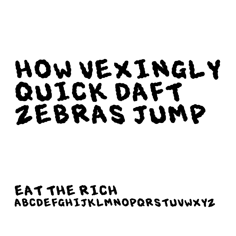
Eat The Rich based on some hand written text from some posters I made in the past. I made it to save time more than anything. Kinda ironically, I’ve not really used this one.
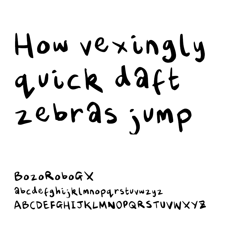
BozoRoboGX was also made as a time saving measure. The idea was to use this for lettering comics but when it’s used in speech bubbles I’m not super happy with the kerning, it’s fixable, but it takes away the point of it being time saving. Though it has come in handy for a number of projects, both personal and academic.
