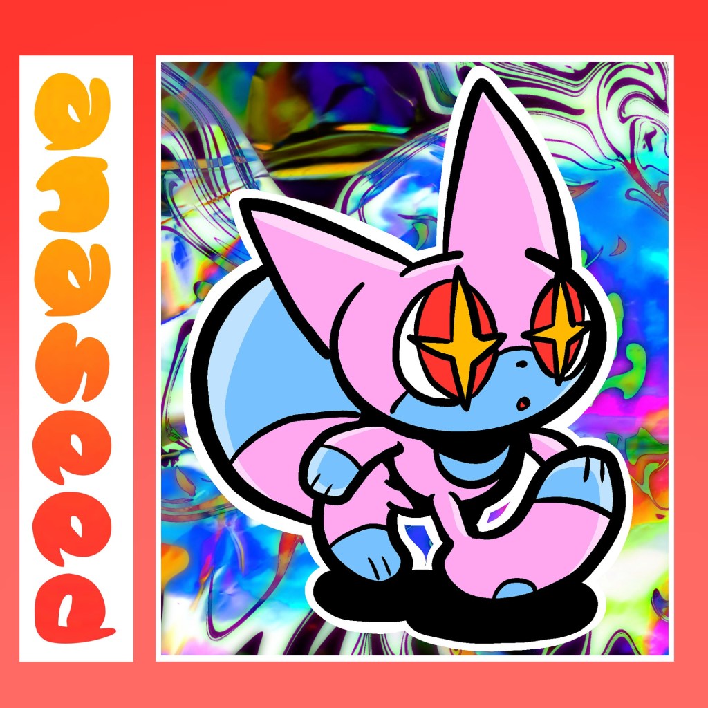
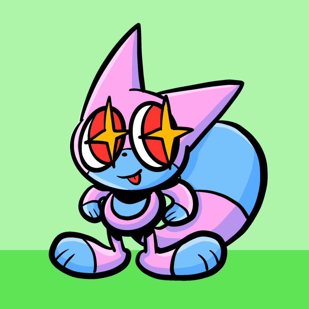
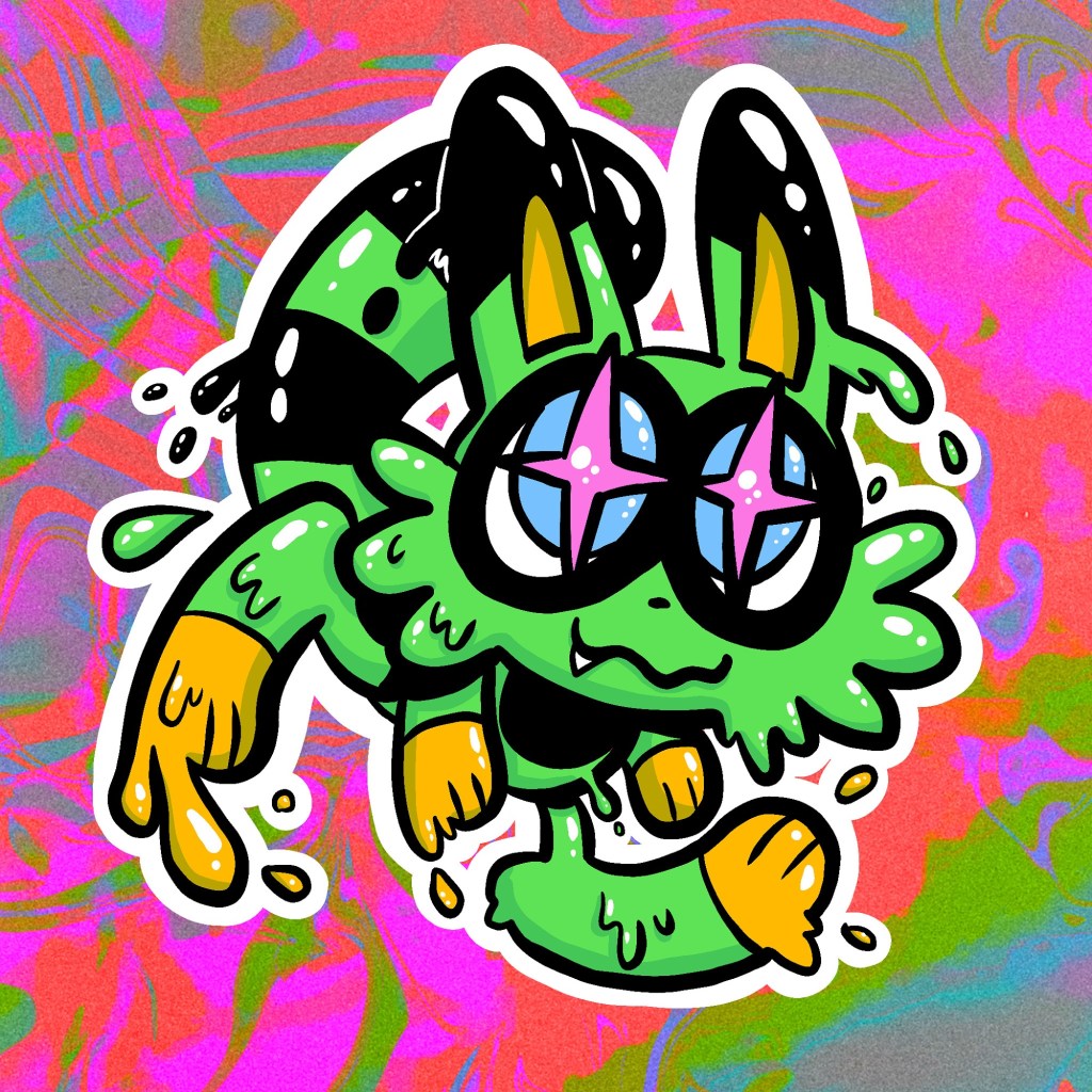
Recently I’ve been working on some stuff under a different pseudonym- cos I love pseudonyms.
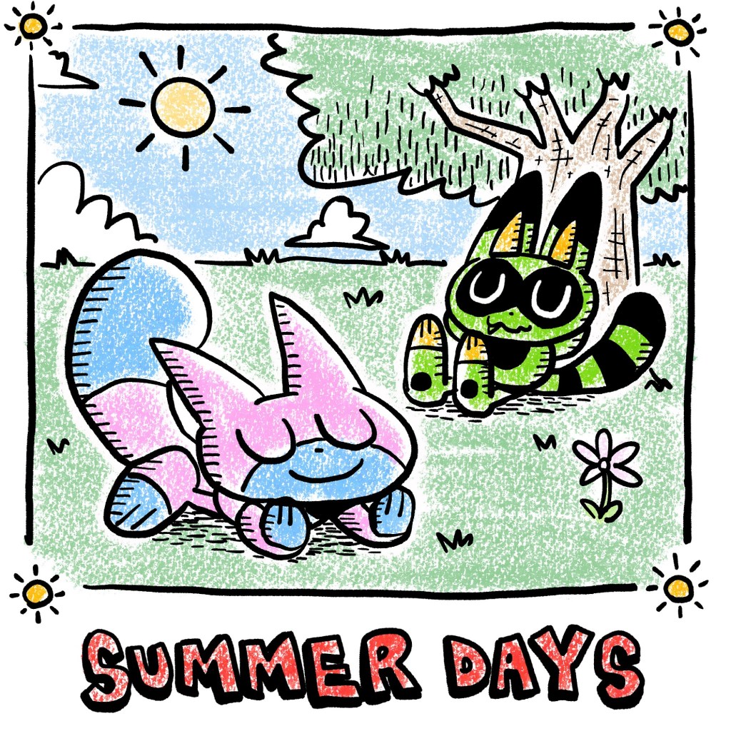
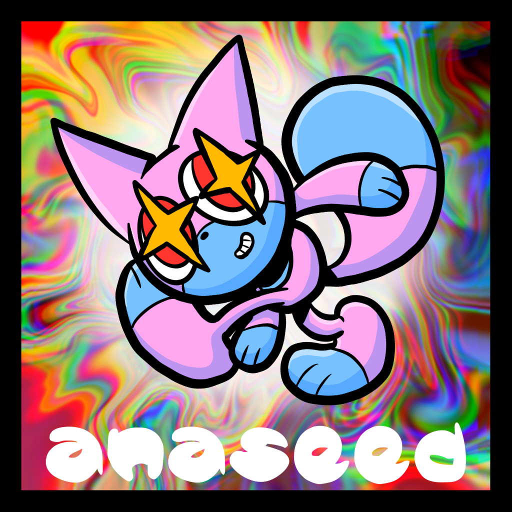
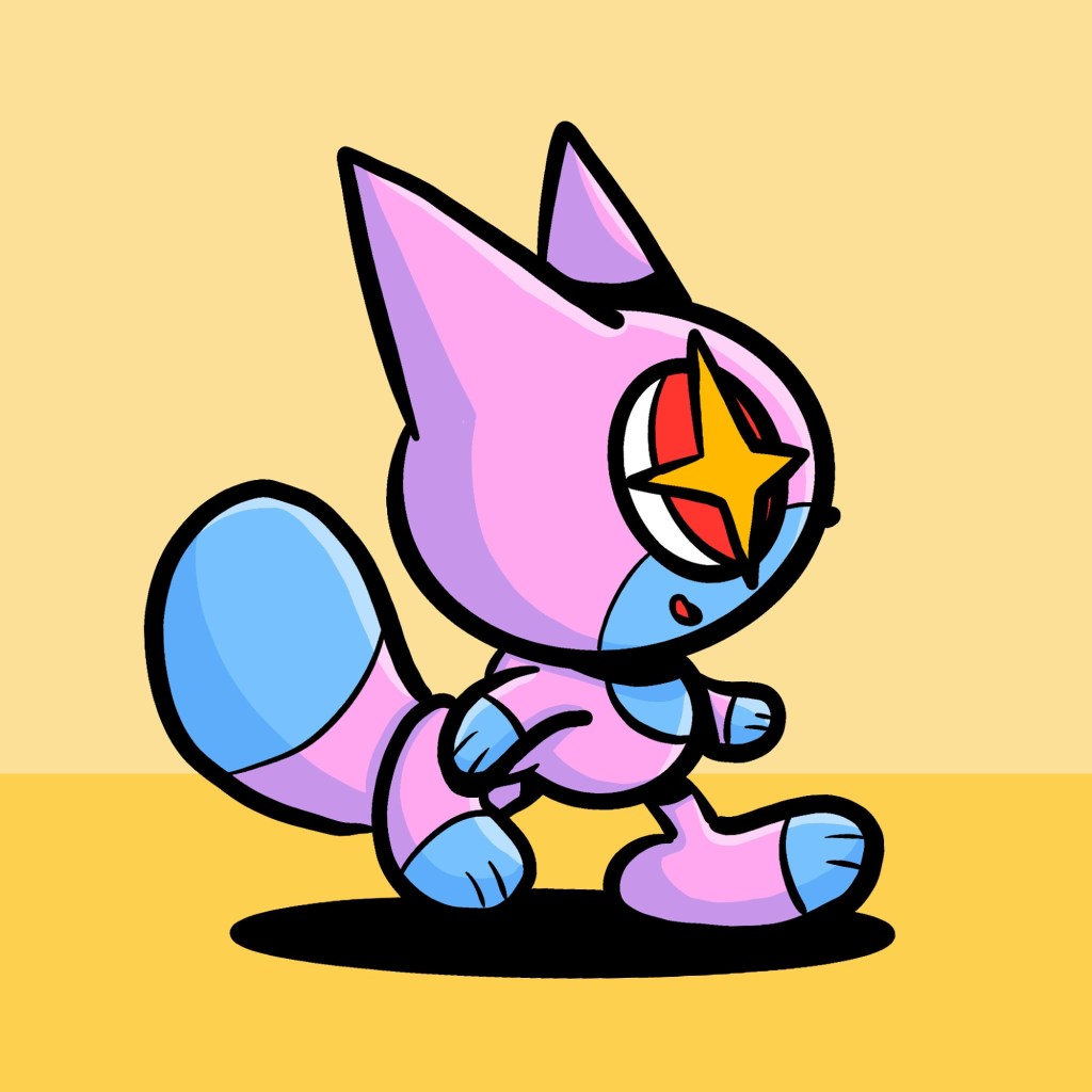
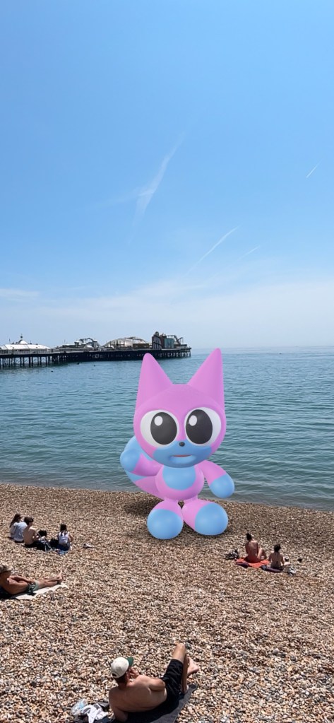
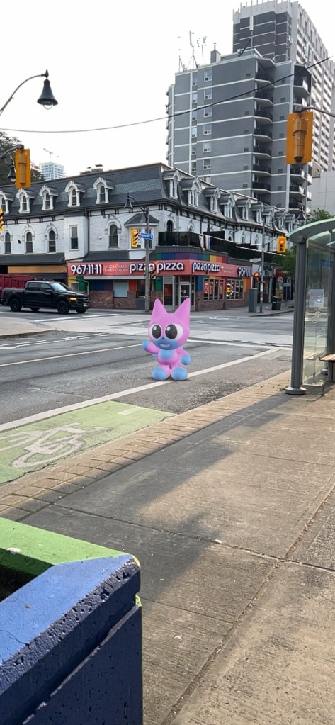
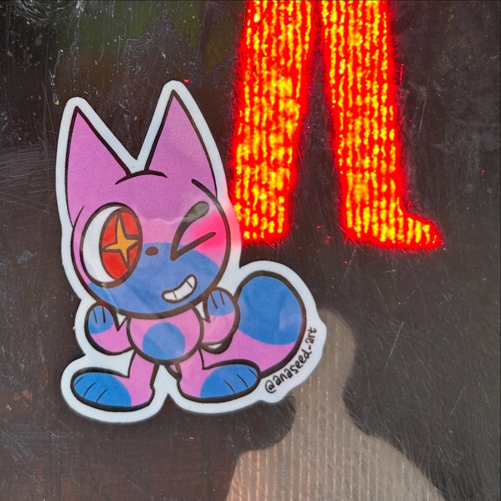
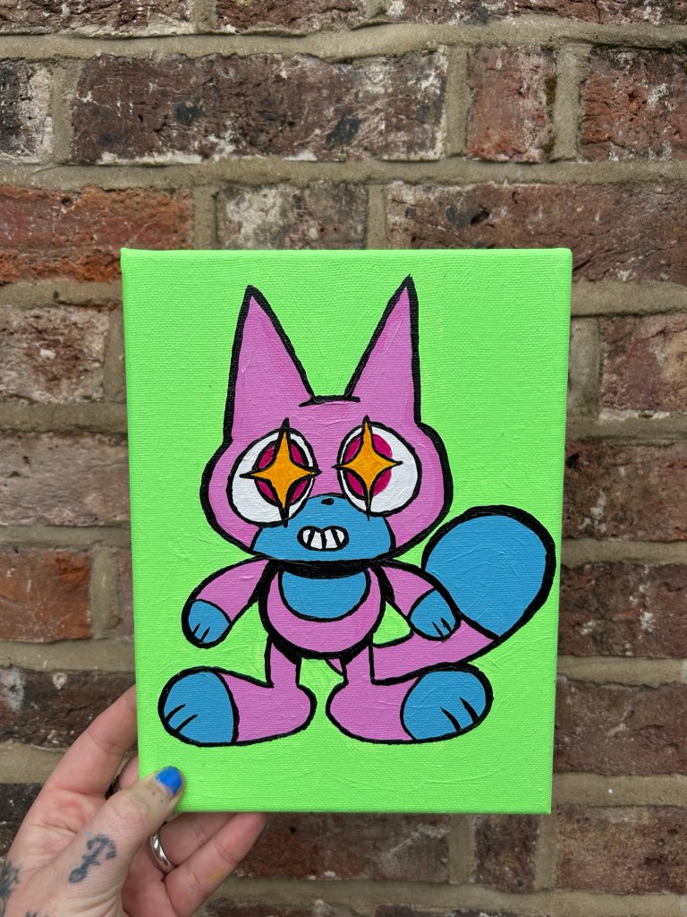
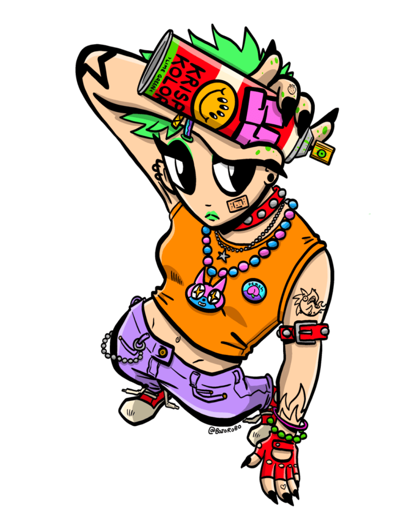
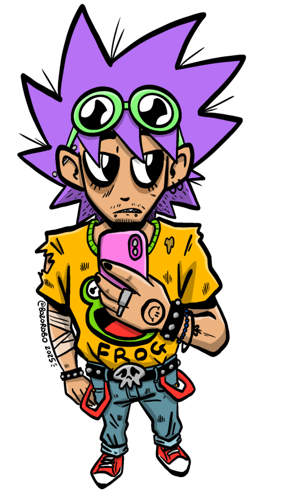
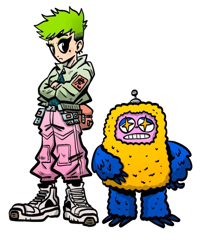
To give me a reason to draw things frequently without having to commit to something like drawing a page of a comic, I’ve been drawing these starry eyed little guys.
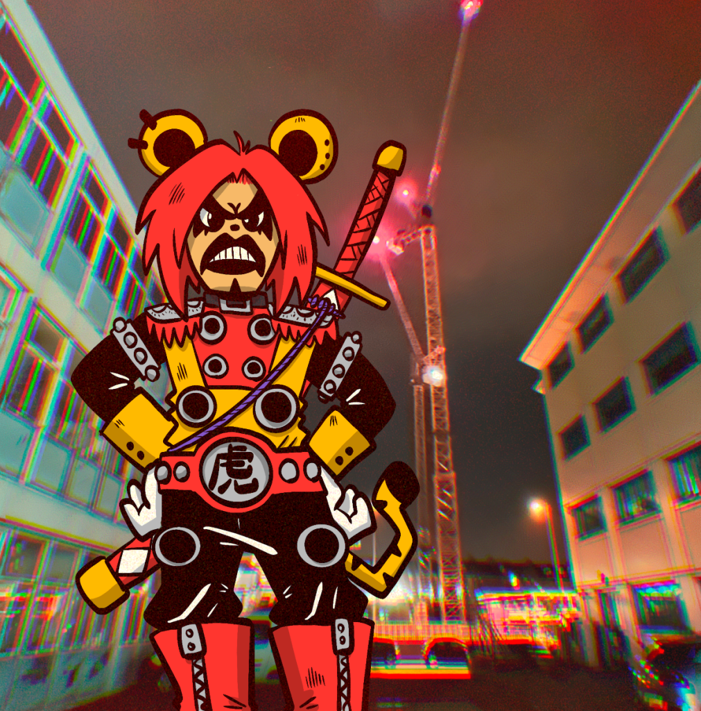
There’s no real end game to this, it’s just giving me an excuse to play around with new styles and medium. I made a CG model of the fox and I’ve been having fun playing around with using that in AR. I’ve also been dabbling in painting.
If you wanna follow/ see more I’m posting these under @ anaseed_art on IG.
Last weekend I did something I don’t do very often, I travelled overseas for an event.
I’ve been meaning to table at TCAF for more or less the entire time I’ve been selling my work at conventions.
This trip was always going to be a bit of a write off due to the massive overheads involved with flights but I wanted to go to TCAF at least once.
Toronto is a nice a city and Toronto Comic Arts Festival was a great event. I loved being able to see a whole bunch of indie comics and creators I usually wouldn’t get a chance to see in the UK. The vibe was exactly the same as that of Thought Bubble, it was super chill and people were there to buy comics(!) Usually at events like MCM what I make over a weekend is heavily reliant on taking commissions, which is fine, I love drawing things for people. But comics take an incredibly long time to make so attending an event where people are keen to buy them is always a plus in my eyes.
Could I have tried a bit harder with being social? Absolutely I could, but that’s not my forte so that’s never going to happen, let’s be honest. (Being jet lagged for the entire duration of my stay in Canada didn’t really help) But everyone that I did speak to was super friendly.
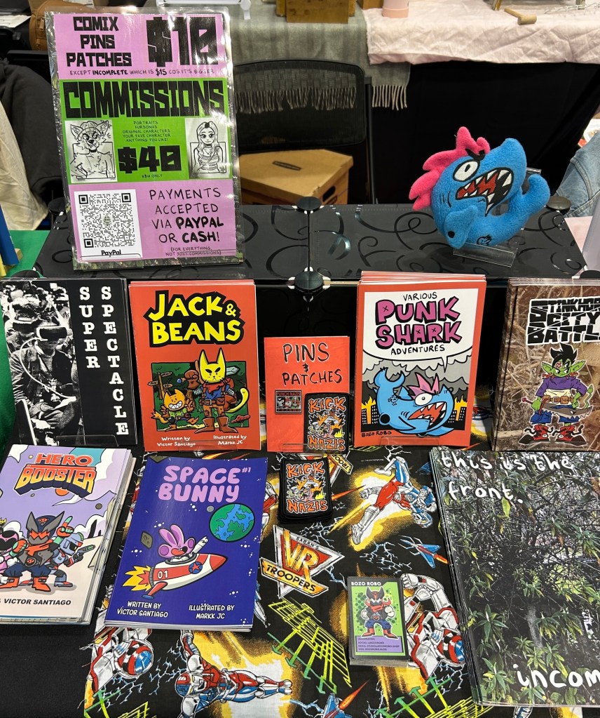
Logistically, TCAF was a bit of a nightmare. For me that is, not the event. Other than when the ceiling started spewing water. As I was travelling by plane I had to very carefully consider what and how much I was going to bring with me. Though, in fairness, what I packed was the perfect amount.
That included; Some stuff for displaying books, 5 different comics (15 copies of each except for Punk Shark which I bought 30 of) a few sew on patches, some pins and some stuff to draw commissions with should the opportunity arise. Oh, and a Punk Shark plush that I got made about 3 years ago and have only now started displaying on my table.
I’d definitely consider doing TCAF again. Maybe in a couple of years. However, I would definitely plan it a bit better. Everything was slightly last minute and it worked out that I’d arrive on the Friday (the day before TCAF) and leave on Tuesday (which is when I’m writing this, sat in the airport waiting for my flight home) Arriving a few days prior and leaving the day after would have been a much better plan, but time limitations – and the means to get time off work- wouldn’t allow it to work out that way. Either way, I wanted a bit of time to explore, I’ve never been to Canada before!
I really like Toronto, it was nice to be in a big city without the constant threat of being stabbed or having my phone snatched. Though, perhaps those threats were present and I just didn’t notice.
This has undoubtedly been the most stressed I’ve been in the run up to a con, but that’s to be expected, I was travelling abroad completely on my own. But it was totally worth it.
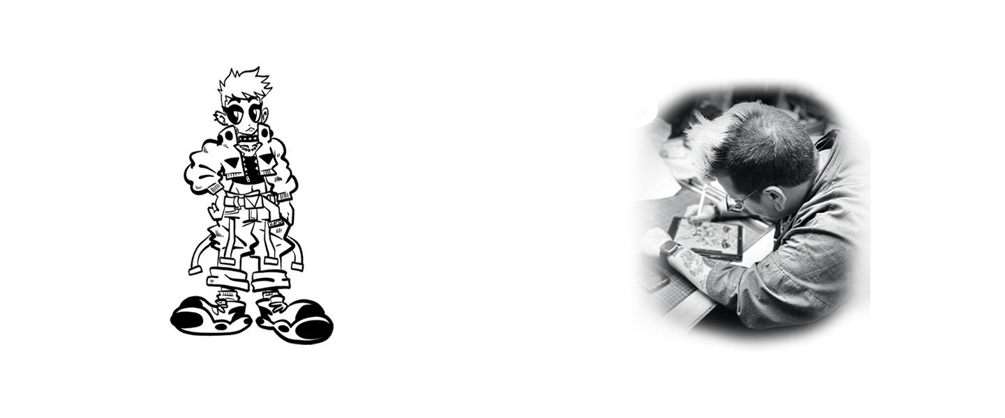
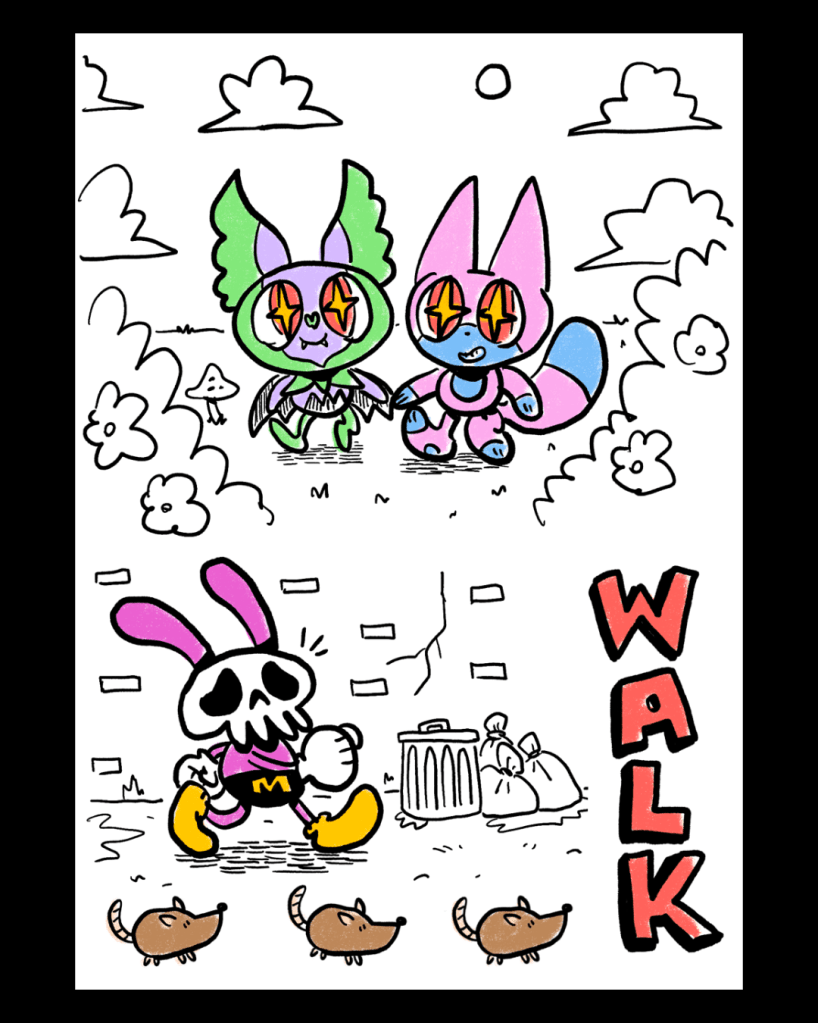
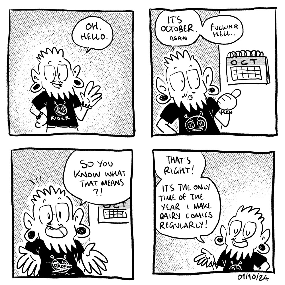
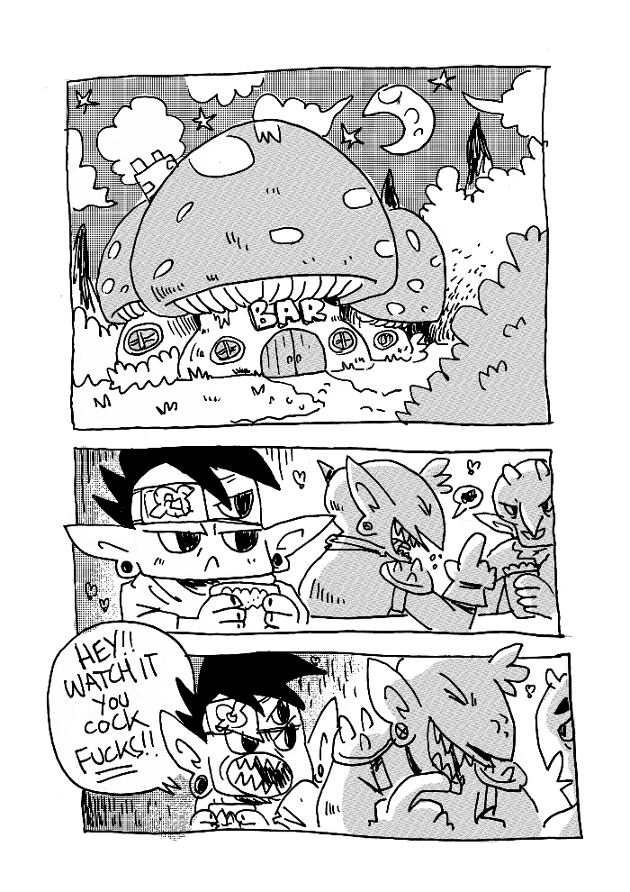
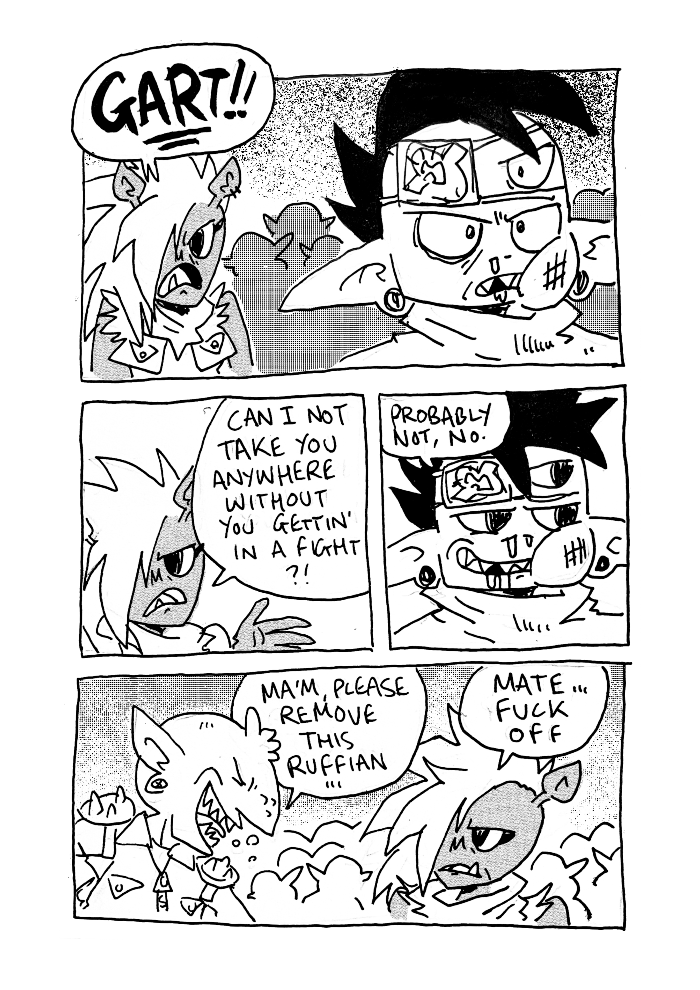
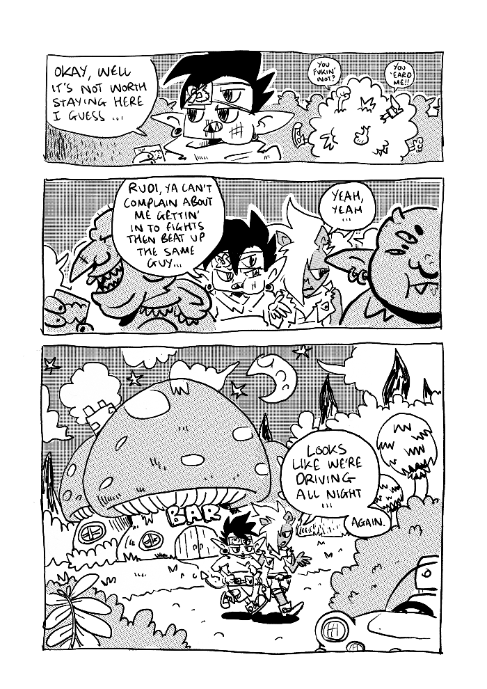
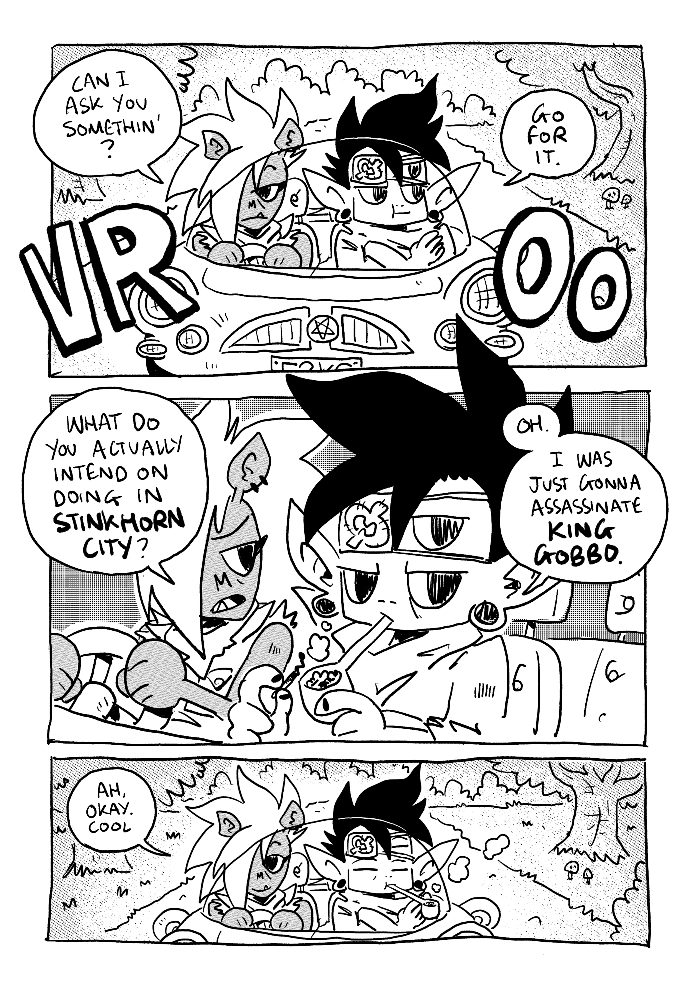
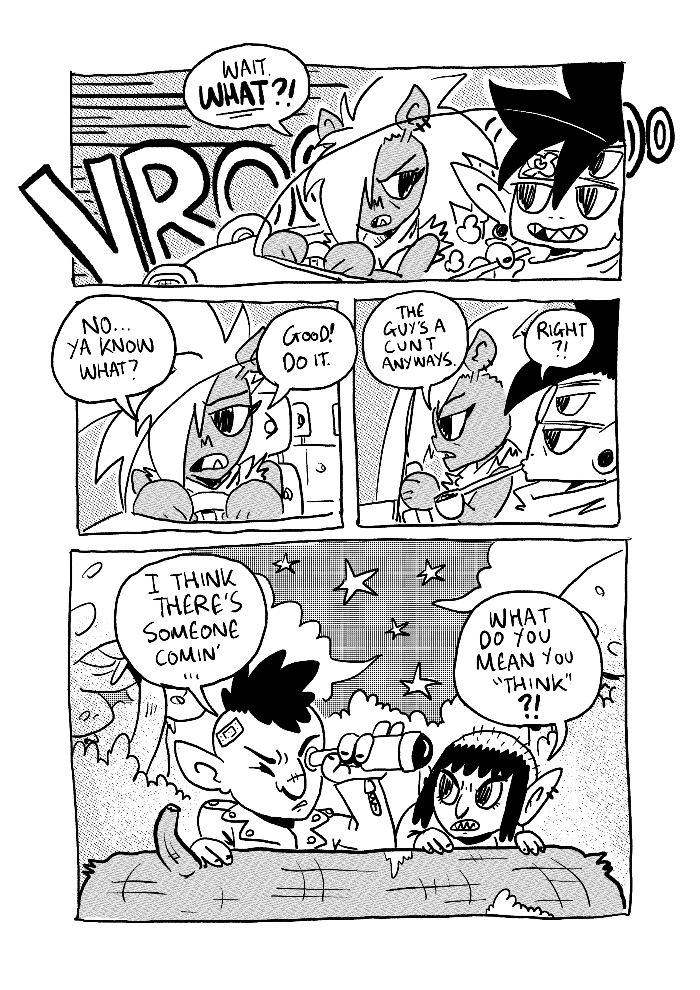
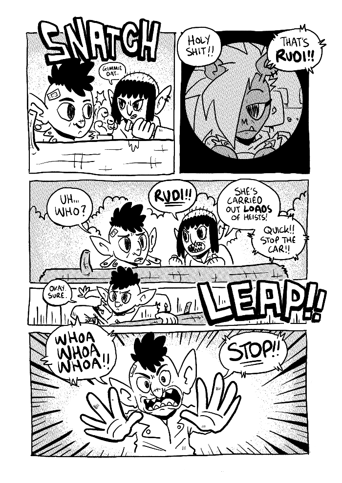
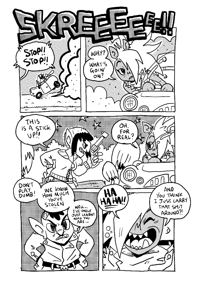
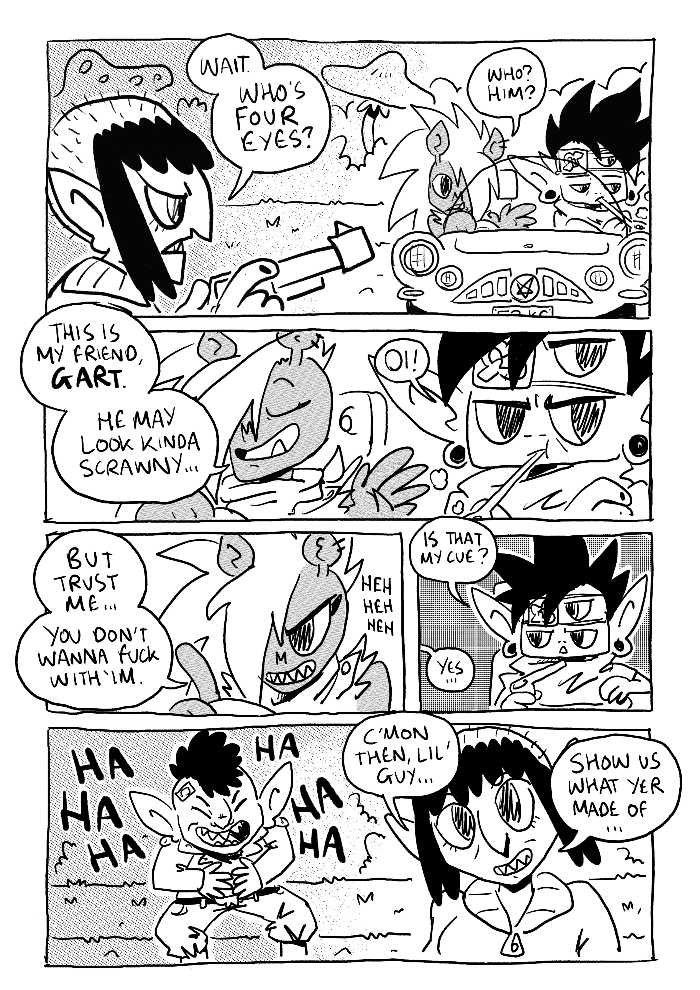
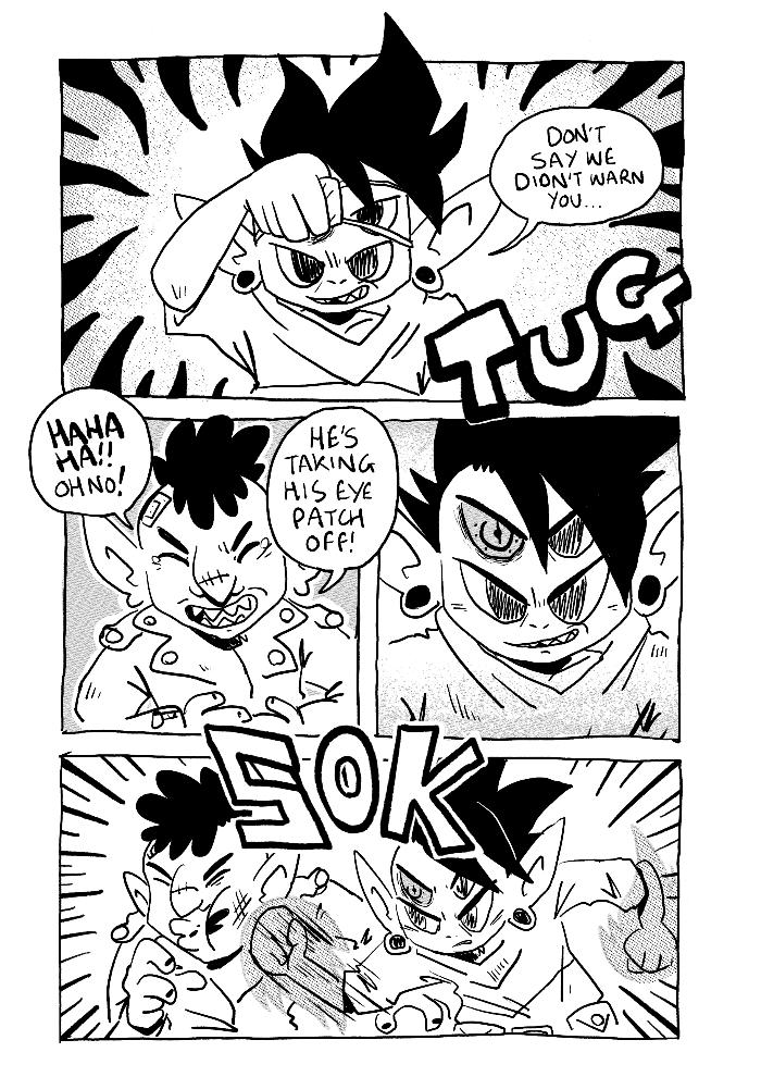
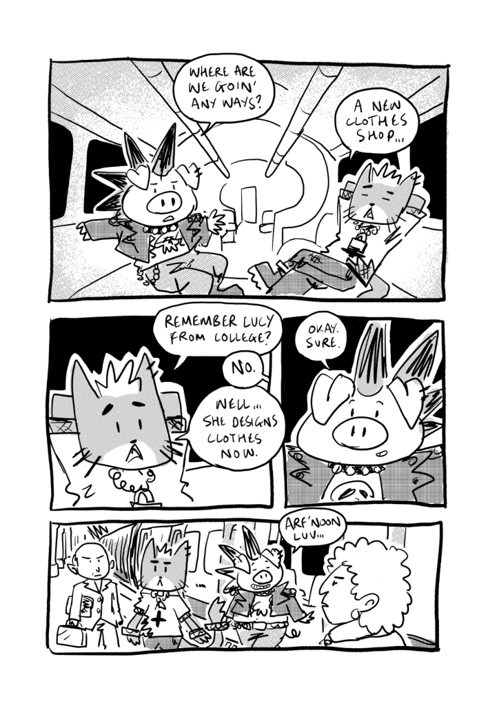
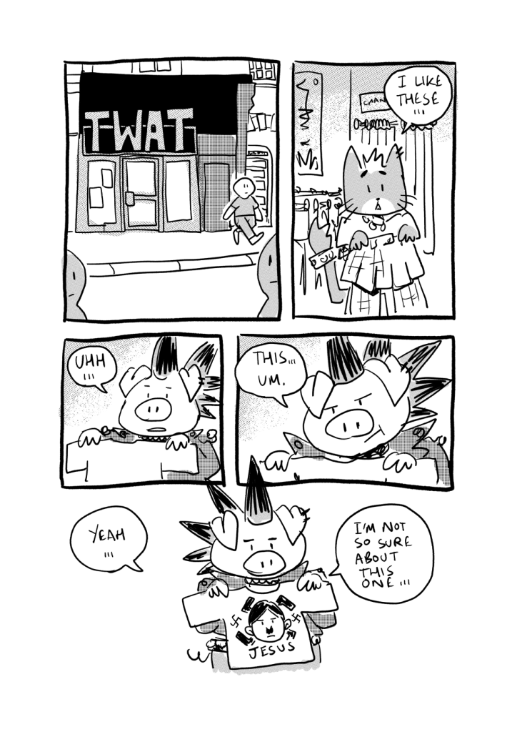
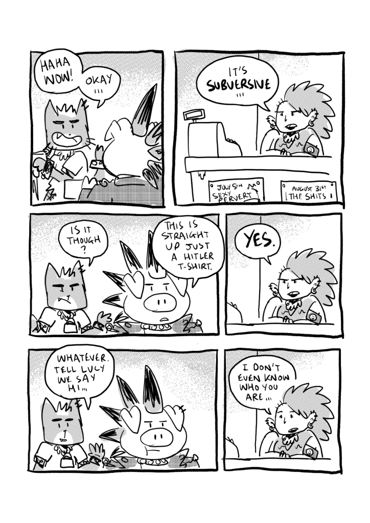
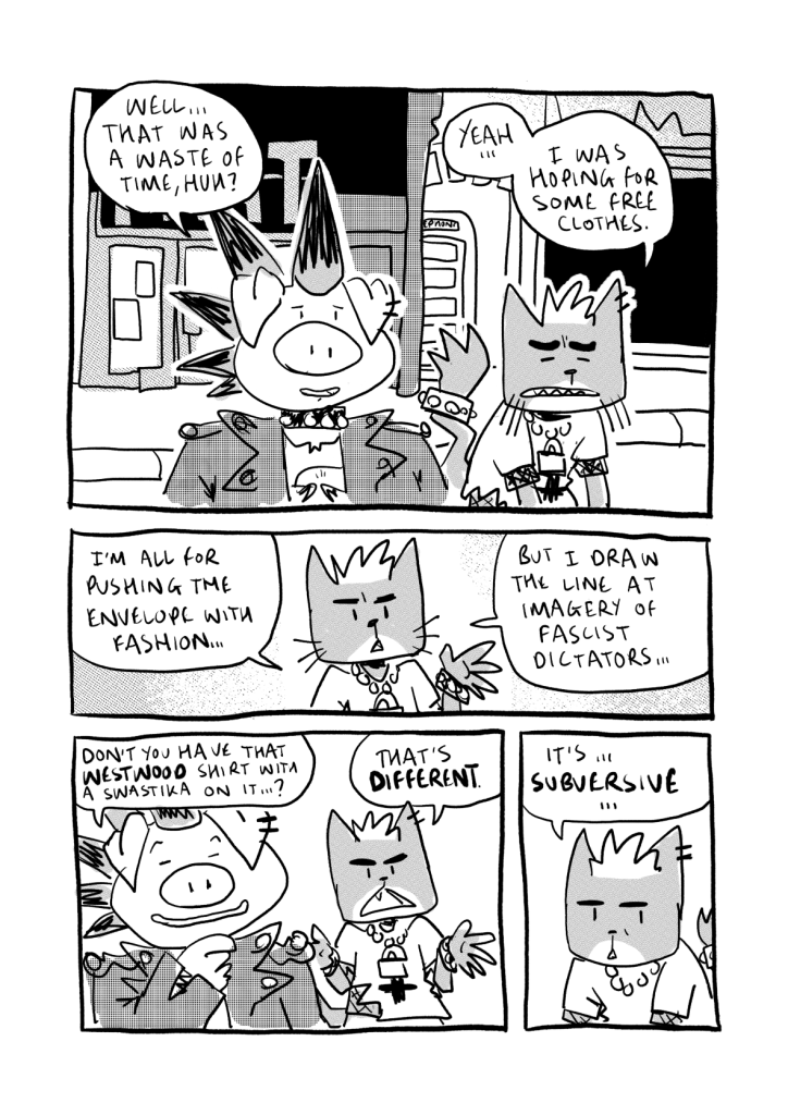
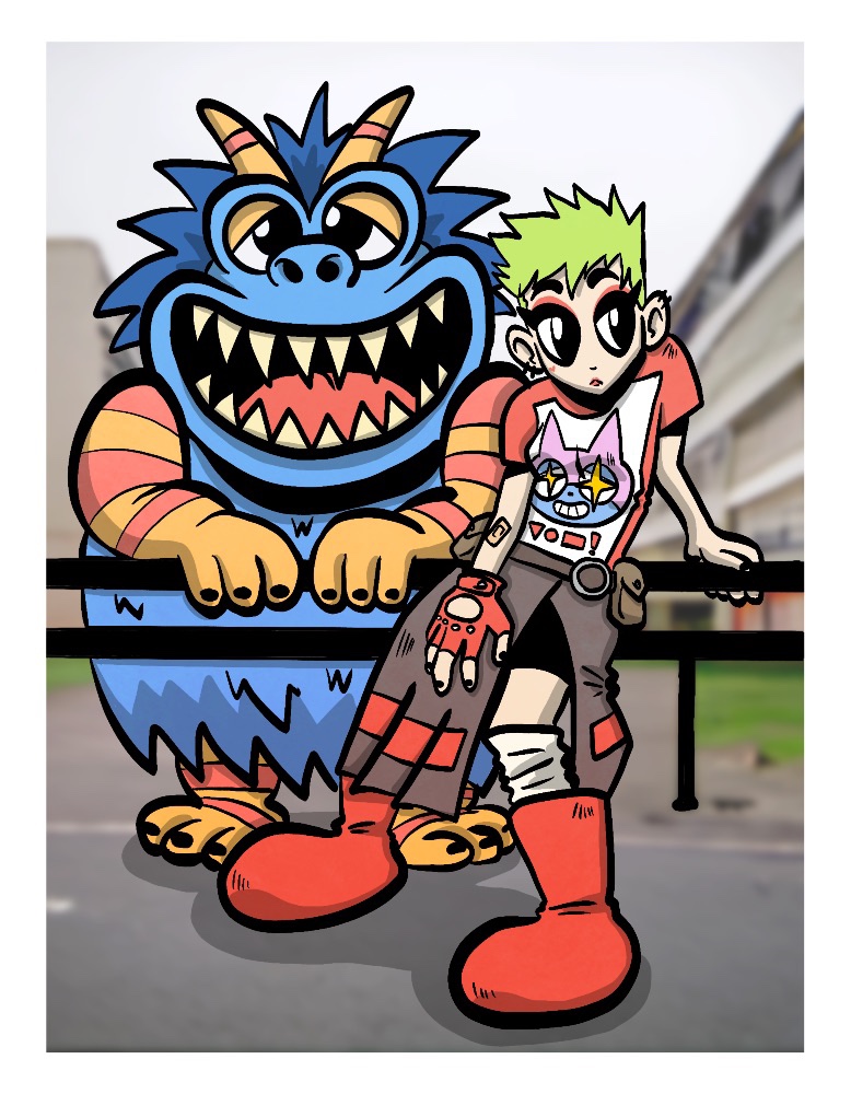
Here’s the first 10 pages of my upcoming comic STINKHORN CITY BATTLE.
This has been a project I’ve been chipping away at on and off for over a decade but I’ve decided I’m going to take everything I’ve ever made for it, smoosh it together and create something new.
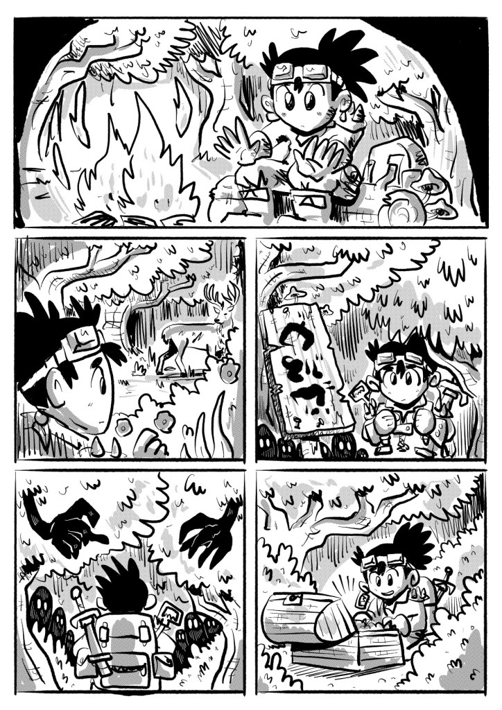
As part of my MA I’m working on a graphic novel that will consist of various vignettes of the characters featured in the comic above.
I’ve been doing a lot of a research about the correlation between queer culture and punk and that research has been informing the basis of the this project.
At the moment I’m trying to flesh out the characters to work out how I want them to interact with each other and the world, so I’ll be making more shorts like this in the coming weeks.